Tuesday, 12 March 2013
Monday, 11 March 2013
Audiance Research
With the overall feedback i was really happy with the result, it was very constructive feedback. One of the main comments was the addition of Ludo, the male part. As well as this people also stated that they loved the:
- Lots of different shots
- The editing.
- The location.
- The acting.
- The effects which where used.
- The light and the effect the it had on the video.
- Well filmed.
- The changing of the colours.
- The focus of the video.
I also recived negative feedback which was, the story if you didn't know what it was it is hard to undertand. I can understand how the story could be hard to understand going back and watching the video.
It was very intresting to recive the feedback in which other people had to over and there feedback is very valuable to the video and also appreciated, thank you to everyone who left a comment and posted.
Point 2 2. How effective is the combination of your main product and ancillary texts?
Above is a prezzi showing how the advert, digipack and my video all link together
DIGIPACK

I had a lot of fun designing the digipack. I was amusing myself deciding what images to use and how to use them. I especially like the 1st and 3rd as the first slide the cover shows an empty bench. This was to give an impression of emptiness whereas after you have listened to it you see the image of Ludo and Letty on the bench and it gives the impression of it being filled.
Not only this but the last slide. This is the slide which connotates the album and the digipack as the house is a mansion. You immediatly get the impression that the video is going to resemble something about wealth.
I chose image number 2, this is the one of the sun shinning. I put this in because in my opinion the song is a very bright and cheerful song.
I have tried to keep the colours as bright as possible as i feel that the video is a bright video, so i wanted them to resemble eachother.
I used photoshop to design my digipack, i think this is a very efficient way of creating a digipack. Once you have taught yourself the basics of it, it becomes very easy to handle.
Evaluation Question 1

1) I think this shot resembels and shows a lot. For insatance in my shot you can see that i have tried to capture a area which is not that luxurious. In the Artic Monkeys video when the sun goes down we can also see that they have tried to capture the same. In the Artic Monkeys video they have used a actress who is usually playing the role of a chavy figure. As you can see they are wearing pretty much the same clothing apart from she is wearing a heavy rain jacket. However i would say the shot that i found is more intimidating than jay.
2) The shot in which i found is Adele someone like you. I think these shots bare some of the same similarities for example, the shot in itself it a close up, not only this but i think Letty and Adele are vaguely similar as they have sensational voices not only this but the way in which they sing. The way they sing is very cathartic this means they are sininging like they want to let there emotions out. This is what draws people in. Letty is not singing however i still felt attracted to the idea of Adele.
3) This shot is a very basic shot and the opposing video is sub focus tidal ways, in my opinion both shots bring you into the video, they are not very intresting but they are very well placed. This shot i found the same the shot from sub focus, this is very intruiging as you can see view from between her legs, in my shot i have tried to cature a Birds eye view of the feet.

4) The opposing shot is take from the Automatic- Monster, it was hard to find a shot of someone walking out of the woods, if you look closely you can see that the band members are walking out the woods as well as this it is the same shot as Ludo walking out of the woods. This is what attracted me to it, as the shots serve the same purpose as well as this the general shot is the same, it is a long shot.
5) This is one of my favourtie shots in my music video as it really shows the atmosphere of the video and it also shows what type of enviroment i want to capture. As you can see from the shot that i have done i have done a mid shot of letty with the same shot eemerging from behind her. Due to the song being called upside down i have flipped the shot so it upside down. If we look as florence and the machine and rabbit heart. They have done the same thing, however they have not flipped it upside down, however they have kept it subtlety in behind.
6) In this shot i have tried to capture deprivation of the shot, as you may be able to tell, the shot in which i have done is Jay who was playing the less wealthy individual is skimming her hands along the wall, the shot in itself is a point of view shot. If we look at Ellie Goulding song anything could happen, we can see that she is using the same point of view shot. This captures the resemblance between the two videos.

7) This is the shot which is struggled the most to find a shot that bared even the slightest resemblance. However as you can see both are a tracking shot. In Gabriella Aplins video please dont say you love me she is in the shot. Where as in my shot i have got a shot of the trees i was passing when driving home, i then doubled that over and ran the new shot backwards to give a new effect. However both are of tracking shouts and bare some form of resemblance to the outside world just passing them by.
8) In my video this is the part of the video that shows how happy Ludo and Letty are together, as well as this it also shows the viewers that they are in fact together. Therefore in this shot they are so happy to see eachother that they decide to dance with eachother. In the opposing shot, which again is Rabbit heart by Florence and the machine, they are doing the same thing, they are having such a good time. As well as this they are both paning shots.
9) Again i think this is another vital shot to both music videos, we can see this by it being the first kiss in both music viideos. Bruno Mars is renowned for writting music about how hard love is and relationships so therefore we can anticipate that there is going to be a kiss in his music videos. In my music video i am trying to show a different life and a different reality between the rich and the poor. As well as this you can also see the passion that is captured in both of the music videos. In my opinion i think that the kiss draws more people into the video. This is not due to everyone wanting to see a kiss but they are done in such different ways that it makes the video a lot more serial and also a lot more intresting.
Friday, 8 March 2013
Video Final Draft
This is the final draft for my video as you can see when you watch it i have changed a lot to it and tried to make it more intruiging and less intresting.
Wednesday, 27 February 2013
This is the print advert

In the print advert i have used a variety of colour, this is because i think using different colour captures your eye and intruiges you into the print advert. However you do not want to use such a variety of colour, if you do then the print advert could loose its sensation and not look as good as it would otherwise.
With the font i took into consideration that the song was called 'upside down' therefore i changed the font style. I have become a lot more immune to photoshop i have learned how to rotate and change things. Albeit i may not be amazing at photoshop i still managed to change the Upside, so it is actually upside down. However i thought i would leave the down bit as normal. If you look in the bottom left of the print advert you will see that it says, coming out on april1st and Debut single upside down. These are in a small font so i thought i would put the sentences in blue and red this is to capture your eye out.
When it comes to the image, when i was reciving feedback about how much they all loved the image in which i used, which was letty and ludo sitting on the bench. That i then faded one out and then put one over the top, this worked out really well because we now had two of the same image one faded over the other and the one on top was upside down, this in my opinion highlights the name of the song upside down, so this was ideal. When i showed people after i had done it they seemed to think it was really cool and matched the name of the song.
Monday, 25 February 2013
This is my rough edit of my movie - Still a lot to be done.
This is the rough edit of my music video.
I have tried to capture a vast variety of shot, so when people look at the rough edit they can then give me the feedback on what they love and what they hate. This means that i can edit it around what they want and thinks works best as they audience. I myself no that there needs to be a lot of work to be done on it. However i think the rough edit is a good start.
The rough edit is a fundamental part to the video not only for the feedback. However it also allows you as the producer to use it as a waypoint to stop and look where you are and what you think needs to be done to improve the video, there is always something that can be done better, no first draft is perfect without any hiccups.
In the video i am trying to capture two things. One is that jay who plays the girl who is not so wealthy. Jay is in a dream fantasising about having a boyfriend like Ludo, not only this but she is dreaming about living a vastly different lifestyle and is dreaming about having money and better clothes. This moves me on to the second thing in which i am trying to capture; i am also trying to capture the difference between the rich and the poor and the conflict that arises between them.
It is very hard to see this in the video, this is one of the things in which i saw, i am trying to make it a bit less subtle and a little bit more obvious to see.
Sunday, 24 February 2013
The print advert Flat Plan

This is my flat plan for my print advert, it is a photo of Letty with the album name above her hear in a smaller font to really drag the attention of people towards it. As well as this they will also be intruigd into the print advert. Giving a higher percentage of them buying the album. The main problem of doing advert or a album is you have to make sure it is highly artistic and intruiging. This is due to the fact that no one is buying albums anymore or Cd's unless it is for their cars or stereos. This therefore means that you have to try and make the advert as intruiging as possible.
The flat plan is vital as it gives people a greater insight into what you will be including in your advert, as well as this it gives you the production team a greater insight into what the people like with the constructive feedback into which they give you. This gives you time to change things to what the people want. This means when it comes down to it, you have changed what you where going to release around what other people want and essentially this should make them a lot happier and intriuge them into the album, or at the least it will catch their attention.
The flat plan also allows for you to get feedback if you send the flat plan around your friends and family as well as this post it on internet sites, as well as this you ask for some feedback. You can take what other people say into consideration as if they have noticed it and think you can improve on it you most probaly should.
Not only this it allows you to use your ideas and imagination to think about what artistic values you could use to change your flat plan to become more artisitc. More colour and artisitic drawings will draw more attention to the flat plan.
Friday, 22 February 2013
3. 3. Investigate how important the print advert is the promotion of the artist/music.
I have learnt a lot about how important and fundamental a print advert is to you selling your album. As well as this how you can achieve higher rates on the market and what to avoid doing, that could cause your album to suffer, or not be as popular as thought.
For example if you where to put you advert advertising the musician who is going to release the album. If you where going to put your print advert anywhere, the most ideal place to put it would be at a concert or gig in which the music is the same genre, and the fans are vaguely the same.
It would mean the people there could possibly be attracted to your
album, this could compulse the people to look at your album in greater deatail, and possibly buy the album. Not only this but it can be used as a infomation advert and can inform the fans of the songs, realease dates, title and other news that maybe related to the release of the album this makes it easier for them to purchase the album,not only this but it also broadens the market, as the more people that look at the album in deatail means that more people are more likely to buy the album. Hence why you would not just put it at music gigs, you would put it in places like the underground in which thousands and thousands of people use that on a daily basis then you are going to get some publicity, or even on a bus. You can find the most unlikely places howevr they get the most publicity.
If you see the poster then you are more than likely to recognise the song when it is realesed.
Thursday, 21 February 2013

This is the album cover of the foals holy fire, which i have modified. As you can see from the originol cover i have changed a lot.
For example the main change is the colour is not black and white. if you look at the waves in the bottom of the photo i have bought out the white parts of the waves cresting a lot more this in my opinion gives it a more serial and beautiful effect.
I think it is vital for people to see what you have changed, the original is very good as you can see how many different things they have included in theirs, i thought that the horses in the photo symbolised the album cover, hence why i did not change this. So i changed the light, i really liked the reflection off the water as the you can see the water is a yellow orange
colour this is becuase of the sunlight reflecting off the water.
However i did change the general ambience as you can probaly see, in the orginal it is a yellow orange colour, however i have increase the contrast and changed the colour to a black and white look, it gives a really nice faded and washed look.
Hope you like it

Wednesday, 20 February 2013
7. Do a flat plan of your digipak (the paper equivalent of a storyboard) work out the layout you want, and plan the type of photos you need to take of your star. Digipak templates are available from Mrs B.

This is a photo of my digipack the way i want it to be. Sorry the drawings are not the most artistic, im not the best at drawing. I wanted to capture the images at the right time. As you can tell from my drawings i am not the most artisitic man to walk the planet. However i think my digipack really saymbolises what my video is really about. The digipack is vital becuase it offers everything you need to know about the album itself and what it includes.
People have different ideas and i wanted to try and keep mine as basic as i can. However i wanted to use images which mean something to the song and not only this, will give people an insight into the album and what it includes.
Instead of taking photos i am just going to take images from the video itself this gives the truth into the video. As well as this it is truthful and will hopefull give that feelling off.
I hope that the digipack gives off the feeling that i am trying to capture the difference between the rich and the poor. As well as this i am also trying to show in the video that jay is also fantasing about living the lifestyle in which letty is living.
Monday, 18 February 2013
5. 5. Take an already existing digipak and copy it on Photoshop, copying everything you can.
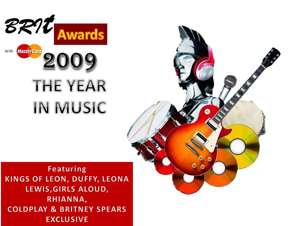
This is my copy.
 As you can see this is the origional album cover, there are some little but obvious changes and differences, for example the fonts are very different, especially the 'Brit' and the awards look very different. Also the master card sign is different. On the origional it is slanted where as on my version it is not as slanted. I have tried very hard to make it as realistic as i possibly could.
 This is my version of the back of the album digipack. I have tried to make it as realistic as possible. However i sturggled. There are actually 41 songs on the album on two seperate CDs. Here i have only listed 7. So there are some things which could of been done better but here is the best i could do.
Wednesday, 13 February 2013
point 6 - 6. Investigate the how the sales of CDs have changed in the last five years. Look at how artists are now making most of their money.
 CD's have always been a 'must have' and have remained to be a very popular product to listen to music via. However music sales in the UK have fallen for the sixth consecutive year, according to
the British record trade. The BPI said combined digital and physical album sales fell 7% last year, from
128.9 million to 119.9 million.The 2009 figures saw an overall drop of 3.5%, despite a rise in download sales., music and books retailer HMV announced plans to close 60 UK stores in the next
12 months.
The company said Christmas sales were down 10% and warned profits would be at
the lower end of forecasts, blaming severe weather and "challenging trading
conditions". The BPI monitored sales gathered by the Official Charts Company and said
sales of digital albums in 2010 have increased by 30%.It also found the combined singles market recorded an all-time high of
161.8m, beating 2009's figure of 152.7m.
CD's have always been a 'must have' and have remained to be a very popular product to listen to music via. However music sales in the UK have fallen for the sixth consecutive year, according to
the British record trade. The BPI said combined digital and physical album sales fell 7% last year, from
128.9 million to 119.9 million.The 2009 figures saw an overall drop of 3.5%, despite a rise in download sales., music and books retailer HMV announced plans to close 60 UK stores in the next
12 months.
The company said Christmas sales were down 10% and warned profits would be at
the lower end of forecasts, blaming severe weather and "challenging trading
conditions". The BPI monitored sales gathered by the Official Charts Company and said
sales of digital albums in 2010 have increased by 30%.It also found the combined singles market recorded an all-time high of
161.8m, beating 2009's figure of 152.7m. It is now easier, and faster, to click a button a download your new favourite
track, legally or illegally. Now thanks to to sites such as youtube and spotify,
it is simple and easy to listen to music over and over again free of charge.
This dramatically effects artists as they do not make a profit from there music.
Itunes helps this by charging for downloads, although this does not support the
sales of CDs.
It is now easier, and faster, to click a button a download your new favourite
track, legally or illegally. Now thanks to to sites such as youtube and spotify,
it is simple and easy to listen to music over and over again free of charge.
This dramatically effects artists as they do not make a profit from there music.
Itunes helps this by charging for downloads, although this does not support the
sales of CDs. Artisits are no longer making a great amount of money from CDs. It is now coming from performing at festivals or concerts, or going to do a private show. If they are going to do a festival then normally the company will fly them out there and pay for their accomadation. As well as this itunes is still used all over the world on a daily basis. Itunes will keep a percentage of the money but the rest will go to the artist. As well as this artist will avertise themselfes, they do this in many different way's such as selling T-shirts, Caps, Flags,Horns and 20 second recordings of their latest song.
Wednesday, 30 January 2013
Difference between digipaks and CD cases
 A digipak contains a fold out mechanism, kind of like a book. The album cover is normally placed on the front, where as the track listings are normally found on the back of the digipak. When you open it up you will find the CD itseld, a little leaflet containg information about the songs and the copyrights of the song and whatever else they want to include on it. As well as this they would of bought artistic value to the fold out's.
I am going to create a 6 sided digipak and my aim is to make it as Intriguing and summoning as possible. I am going to do this by using colourful images and large fonts.
A Cd cover, this is also known as a jewel case, it consist of a plastic protective cover, and then a holding CD tray in the middle where you can put your CD. At the front it is normally left clear so you can put the album cover in it, this means that when you look at the front of the Cd you will see the album cover. Then on the back this is where the track listings are found, obviously with the Cd in the middle.
It has some advantages and disadvantages to a digipak,the advantage are; Cheaper, more reliable, less easy to damage, easier to carry, more accesable and its lighter. Where as the disadvantages are; does not contain as much artwork, does not contain as much information and is not as 'pretty.'
My digipak will contain;
- Artist name.
- The song.
- Infomation about the song.
- Album cover.
- The Cd.
- Information on song.
- Information on video.
- My company logo.
- Company info.
- Lyrics to the song.
Friday, 25 January 2013
Font Tests
ALBUM COVER FONTS
Tomorrow –
Accent SF
Tomorrow - Adventure
black SF
Tomorrow
– Algerian
Tomorrow
– Balloonist
Tomorrow - Copperplate
Gothic Bold
Tomorrow
- Blackoak Std
Tomorrow
– Castellar
Tomorrow –
Digital
Tomorrow
- Goudy Stout
POSTER
FONT
Poster font - Goudita
Heavy SF
Poster
font - Wide Latin
Poster font - Rockwell
Extra Bold
Poster
font - Rosewood Std Regular
Poster
font - Ultra Serif SF
Poster
font - Engravers MT
I have been experimenting with different fontds in which i would use on my album cover or poster. I could not decide between one so i put a few of my favourite up, i think these really bring the attention towards the digipack. They are quite alternative fonts as is the genre i of the song.
I decided to call my album tomorrow, as i am trying to caption the difference between the rich and the poor. So i thought that tomorrow would be a sutible because of looking towards the future and seeing what it holds. I thought that calling it the future was to ' mainstream.'
Wednesday, 23 January 2013
Marketing Your Album
 If we look at for instance Pamola Faith, She realease an album on November 27, 2012. The album in itselelf is called fall to grace. When we look at the album cover we can see that it is very artisticly drawn. As well as this it has loads of colour to it, as it looks like she if floating. This could emphasise the point of it being a very realxed and chilled album. As well as this there are also parrots flying around her. Parrots are world renowned for being a house hold bird and a bird that can talk to you, not only this but they are renowned for being a 'thing of beauty.' Due to the Parrots being so colourful and beautiful and flying around her. She herself is wearing a long red dress and floating in the middle of the album cover, it looks like she herself is a bird of some origin.
 So the photo defiantly draws your attention into it and intruiges you more and more. I think that the photo on the album cover is vital, as you need something to draw the audience into it. Especially in the modern day when the majority of people will download it straight from ' you tube' or Itunes.
 When we look at the font which has been used to spell her name, it is again a very artistic font which grabs your eye. I in person think that the font must have been hand written and pressed or copied onto the album cover as not all the letters are the same size. However when we look at the album name we can see that it is a bacis cambria font. Roughly size 16, this may be because if people have seen the album photo and the artist name, they may already bet thoroughly intreged in the album.
 As well as this there are also talk shows and radio interviews in which the artist will participate in, this gives them an upper hand as they have been in the public eye, and represented themselves in the best possible way they could. Due to them being in the public eye on a frequent basis, this intruiges the public on a broad scale and we look them up. A prime example of this is a band called the foals, they where not heard of on a vast basis, then they went on radio one, they where established as a very 'cool' band and people loved that.
 Talk shows are on of the most productive ways in which a artist will publicise itself. As they would do talk shows all around the world in as many different situations as they can. This will again put them in the in the public light, but then again any form of press is good press. Also because the artist will be doing a talk show in several different countries at a time, he or she is being seen by a larger amount of people. As well as this but because the artist is being asked on a frequent basis to come and do a talk show, this is going to boost their confidence.
Monday, 14 January 2013
Wealthy - Dylan and Letty
 This is Dylan Marshall, I have chosen him to play Letty's boyfriend. He is 17 years old and in year 12. He is good friends which is why i thought that the two of them together would go well. Dylan is very immature so he would always have a smile on his face, which is perfect for the music video. As when you listen to the song it puts you in a good mood.
 This is letty, she has the resposability of playing the wealthy girl. She is a very good singer so therefore she will be sining in some sections of the song. She is also very classicly beautiful. Which is perfect for her playinfg a wealthy women. She is 17 and in year 12. All of the main actors are in the same year.
Wednesday, 9 January 2013
Casting shots..... Less Wealthy women and her Boyfriend
 I chose Ludo for my video becase he has been a very good friend of mine for the past year and a half. As well as this he is very flexible in what he does and where he plays. As well as this he will be playing the role of Jays boyfriend. So he has well will be playing a poverty stricken character. Ludo himself is 18 years of age and lives in belgium. He speaks three languages and is in year 12. He would be perfect for the role as he can go where you want him too and as well as this he can sometimes have an agressive attitude.
This is Jay, i chose her for my music video because she is wanting to become a proffesional singer, so she has a very unique voice. As well as this she can turn her voice into a reflection stage. Jay will be playing the poverty stricken girl.

Subscribe to:
Comments (Atom)