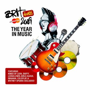
This is my copy.
 As you can see this is the origional album cover, there are some little but obvious changes and differences, for example the fonts are very different, especially the 'Brit' and the awards look very different. Also the master card sign is different. On the origional it is slanted where as on my version it is not as slanted. I have tried very hard to make it as realistic as i possibly could.
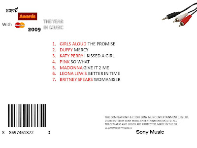
 This is my version of the back of the album digipack. I have tried to make it as realistic as possible. However i sturggled. There are actually 41 songs on the album on two seperate CDs. Here i have only listed 7. So there are some things which could of been done better but here is the best i could do.
No comments:
Post a Comment